
When working with digital photographic imagery for use in digital printing you should follow the same basic rules as when preparing images for offset print. All enhancing and editing were done using Adobe Photoshop CS 4. (v11)
Special considerations when printing specifically to a digital press.
Avoid images with light backgrounds unless completely clipped to white.
Unsharp mask
Consider sharpening the image with the Unsharp mask filter.
For toner based digital presses, I like to start with these settings for unsharp mask:
Amount: 70%
Radius: 1.2 pixels
Threshold: 0
[caption id="attachment_2409" align="alignleft" width="300"]

Without UnSharpen Mask[/caption]
[caption id="attachment_2410" align="alignleft" width="300"]

With UnSharpen Mask[/caption]
Brightness and Contrast
Consider adding a little contrast to extremely flat looking images. Just don't over do it!
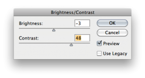
[caption id="attachment_3273" align="alignleft" width="243"]

Original flat image[/caption]
[caption id="attachment_3272" align="alignleft" width="243"]

With Contrast Added[/caption]
Hue/Saturation
You can quickly enhance an image with the hue/saturation tool
In this image, we adjusted the green hue out.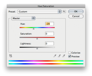
[caption id="attachment_2428" align="alignleft" width="300"]

Original green image[/caption]
[caption id="attachment_2427" align="alignleft" width="300"]

Hue adjusted image[/caption]
Color Balance
If your image looks to have a strong or dominant color, you can quickly reverse the problem with color balance. Pull the sliders until the image looks more gray balanced.
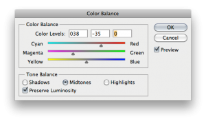
[caption id="attachment_2437" align="alignleft" width="300"]

Image with strong green/cyan tone[/caption]
[caption id="attachment_2438" align="alignleft" width="300"]

Image with Cyan reduced and Magenta added[/caption]
Profile Assignment and Conversions
Assigning Correct Color Profiles to untagged imagery is highly critical for your color management success. Going back to the Color Settings File that tell the Adobe Creative Suite programs how to handle color when opening files and documents, the settings file handles issues like non-existent color profiles when opening images in Photoshop. I'm sure you have seen this warning at one time or another.
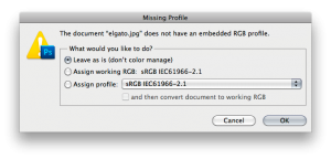
Well, what this is telling you is that the image you are opening doesn't have an embedded color profile. I like to think of it as not having a name tag, saying it's from this place or that place. If you ignore this you most likely will end up with less than great color. Ignoring it just automatically makes the image assume the working color space, in my case the sRGB color space is my working space. This might work out just fine, but it is always good to check other profiles for better assigning.
When you get the missing profile warning, check the "leave as is" and hit okay. Now you need to go into Edit> Assign Profile.
At this point you can select from one of the standard RGB color spaces. There are five typically pre-configured in Photoshop, they are Adobe RGB (1998), Apple RGB, ColorMatch RGB, ProPhoto RGB and sRGB IEC61966-2.1.
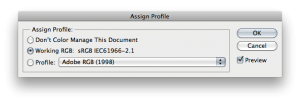
Typically images without embedded profiles are in Adobe RGB or sRGB. When images are saved for the web, sRGB is the profile that the image should be converted to in it's final stage. You can leave image that are not going to the web as they are and just include the profile when saving the file. For now, assign a profile that makes the image look most realistic and pleasing to you, then say Ok.
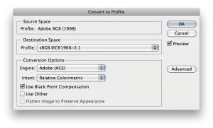
Next, you will want to convert the image based on your specific needs or where the image is planning to be used in it's final form. If it's going to be an image on the web, then convert the image to sRGB and save it, you can include or not include the sRGB profile when saving the jpeg, either one will work fine in browsers, but one will be slightly larger in file size. If you assigned the image any of the other profiles, make sure you save and embed the profile at that time.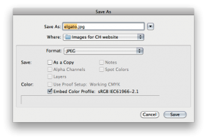
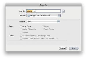
A note about PNG files for web: If you like using PNG files for websites, that's great. You will notice when you save PNG files that you cannot embed a profile to that file format. Therefore it is crucial that if the image is in fact going to the web, you should convert the image to sRGB color space, then save it. The image will have the proper color appearance online.
For more about Assigning and Converting see:
RGB Just Wants to Have Name
[caption id="attachment_2448" align="alignleft" width="164"]

Correctly Assigned Adobe RGB Profile as Source, then converted to sRGB for web[/caption]
[caption id="attachment_2447" align="alignleft" width="164"]

Adobe RGB Source but assigned sRGB incorrectly prior to conversion[/caption]
[caption id="attachment_2446" align="alignleft" width="164"]

Completely the wrong profile assigned, assigned ProPhoto RGB and the original was Adobe RGB[/caption]
Create More Compelling Layouts
Use imagery with "white space" or "negative space" to place copy in.
By utilizing "white space" in imagery, you can end up with a much more compelling design. The Macy's image initially had a pink background. We extended the left side by adding space to the canvas of the image then tranforming the left side of the image by stretching a small sliver of space on the left.

Please fill free to add your comments to this article. If you have better or other great suggestion, why not share with everyone!