Are you tired of the prints you pick up not turning out like you expected? You made a bright blue or green chart in PowerPoint and you are very disappointed that the printing wasn't as bright?

Well, don't be a meany and blame the printer! They are doing the best job they can from the file they are given. The problem is in the creation of the color itself on your computer screen. Let me explain... Microsoft Office programs don't have the ability to show you what the printed piece will look like in real life. Now you are probably wondering why the program would need to do such a thing in the the first place! Well, here are the hard, cold facts about what you see on your screen versus what comes out of a printer.
About color on screen and on paper
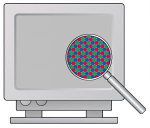
1. Computer displays are made up of electron beams and phosphors, they create light by adding a mixture of Red, Green and Blue to create the color. Mix all three at 100% and you get white. Black is made up of 0% of all three colors. By the way, these colors are called
Additive Colors.

2. Printing on paper is done in an opposite fashion. The paper starts out as white and inks, Cyan, Magenta, Yellow and Black block out the light emitted from the paper. So, if you have 100% magenta and 100% Yellow, you end up with Red. The opposite of Red is Cyan, so, Yellow and Magenta subtract Cyan from the paper surface at 100%, thereby creating what we think of as Red. These are called
Subtractive Colors.

The problem is that paper is only as bright as the light that is illuminating it and its also not back light like computer displays. Your computer display can produce virtually as many colors as your eye can see, well, not quite, but paper is very limited in it's ability to produce vivid, bright colors, like your display. Lay down all three, Cyan, Magenta and Yellow and you block out all white and end up with a black, or almost black. Black ink is also used to enhance the darkness and clarity.
In the professional design world, graphic designers use applications that have the ability to show a simulated paper version on screen prior to printing. This way they can work inside the color space of the paper and ink they will end up using.
It is possible to match the monitor to a proof print, but it requires the proof print be lit in a specific way, with the right color of light and brightness. It also requires the monitor be calibrated to the same specification as the viewing booth that is lighting the print. This is all possible, but for PowerPoint and to have a bright green, I suggest a different route.
We have created a
Word and PowerPoint document with a variety of colors. You can download the files, have them printed by your favorite shop, then take the prints back to your office and pick the colors you like. Now, open the PowerPoint file and copy then paste the color swatch into your presentation. Now when you get the presentation printed, you wont be in for a big surprise!