Design For Print
Nothing is more disappointing than spending countless hours working on a print design only to find that it isn’t going to turn out the way you’ve intended. Misprints can be avoided if a few simple rules are followed. At AlphaGraphics, we want your designs to be visually striking in order to provide the best possible first impression.
Layout
Make a layout. In the design process, determine what program or software you will be using as well as the appropriate size dimensions.
Medium
The medium that you print on can largely influence the design. In order to determine the layout, you must first determine what substrate you will be printing on. Paper? Wood? Fabric? Metal? Know the medium, then begin.
Alignment
Select which alignment will be the most visually appealing. There are four basic kinds of alignment: Left aligned, right aligned, centered and justified. The alignment you select will depend on the message you have, the amount of text provided and the particular publication.
Negative Space
Whoever said negative space is bad was wrong. Negative space, otherwise known as white space, is not an empty space that has to be filled. It provides a balance in the design and also avoids unnecessary clutter or distraction. It allows the design to breathe. Leave some negative space in your design and see what it can do!
Bleed

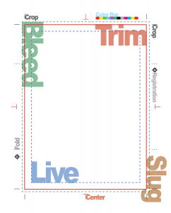
If necessary, incorporate a bleed into your design. A bleed is printing that goes to the edge of the sheet, requiring trimming to make the print run to the edge. A bleed allows for a little buffer room for inaccuracies. Include a bleed in your design whenever the color touching an edge isn’t the color of the paper.
Fonts and Lines
Font selection can make or break a printed design. Think legibly.
Limit Fonts
Select two, at most three, fonts that are complementary as far as titles, section heading and body copy. Having too many fonts distracts from your design and message.
Avoid Display Fonts
Display fonts might appear pretty and fancy, but they aren’t always the easiest to read—especially when it comes to the substrate they are printed on. In fact, some display fonts cannot even be reproduced with
cut vinyl or routing out of wood or metal.
Font Size
Make sure that your font size is big enough or small enough. You will need to adjust your font size depending on what you are designing and printing for. The text on a
brochure would be significantly smaller in comparison to the text on a billboard or a
banner. Know the medium and remember that people need to be able to read the text.
Tracking and Kerning
Determine appropriate tracking and kerning, word spacing and line spacing. It really depends on the message you want to portray and the emphasis you wish to make on certain words.
Font/Line Height and Weight
Remember, the closer the lines of text are, the more difficult it can be to read. Adjust the stroke (width or thickness) of the font. It may appear smaller on the screen, but it can be thicker once printed.
Color
Difference Between RGB and CMYK
Before beginning the color selection process, make sure you know the difference between RGB (red, green & blue) and CMYK (cyan, magenta, yellow & black) color modes. CMYK can produce more colors in comparison to RGB mode. If you create your designs in RGB mode then you run the risk of losing your color selection at print because RGB doesn’t offer as a wide a variety of colors as CMYK and printers print in CMYK.
 Appealing Color Scheme
Once you are in the right color mode, it will be easier to select an appealing color scheme. Follow the rules of complimentary colors found on the color wheel.
Avoid color discord or color clashing. Don’t pair two colors that are widely separated on the color wheel. This will take away from the visual appeal of your print. Discordant colors cause a struggle for the eye to find the line between each color.
Correct Resolution
The standard for print resolution is 300 dpi (dots per inch). The more resolution you have, the clearer the detail will be. You can’t scale up the resolution of a design, so make sure that you do so in the document setup.
These guidelines may seem unimportant or tedious, but they can make or break a printed design. Remember, you have to learn the rules before you can consider breaking the rules. Master these rules and guidelines and work with our team at
AlphaGraphics to ensure for a visually striking
design!
Getting Started
Need more help or ready to start your own project? Call us at
(801) 426-6200 or request a quote below to get started today!
[wpforms id="313" title="true"]