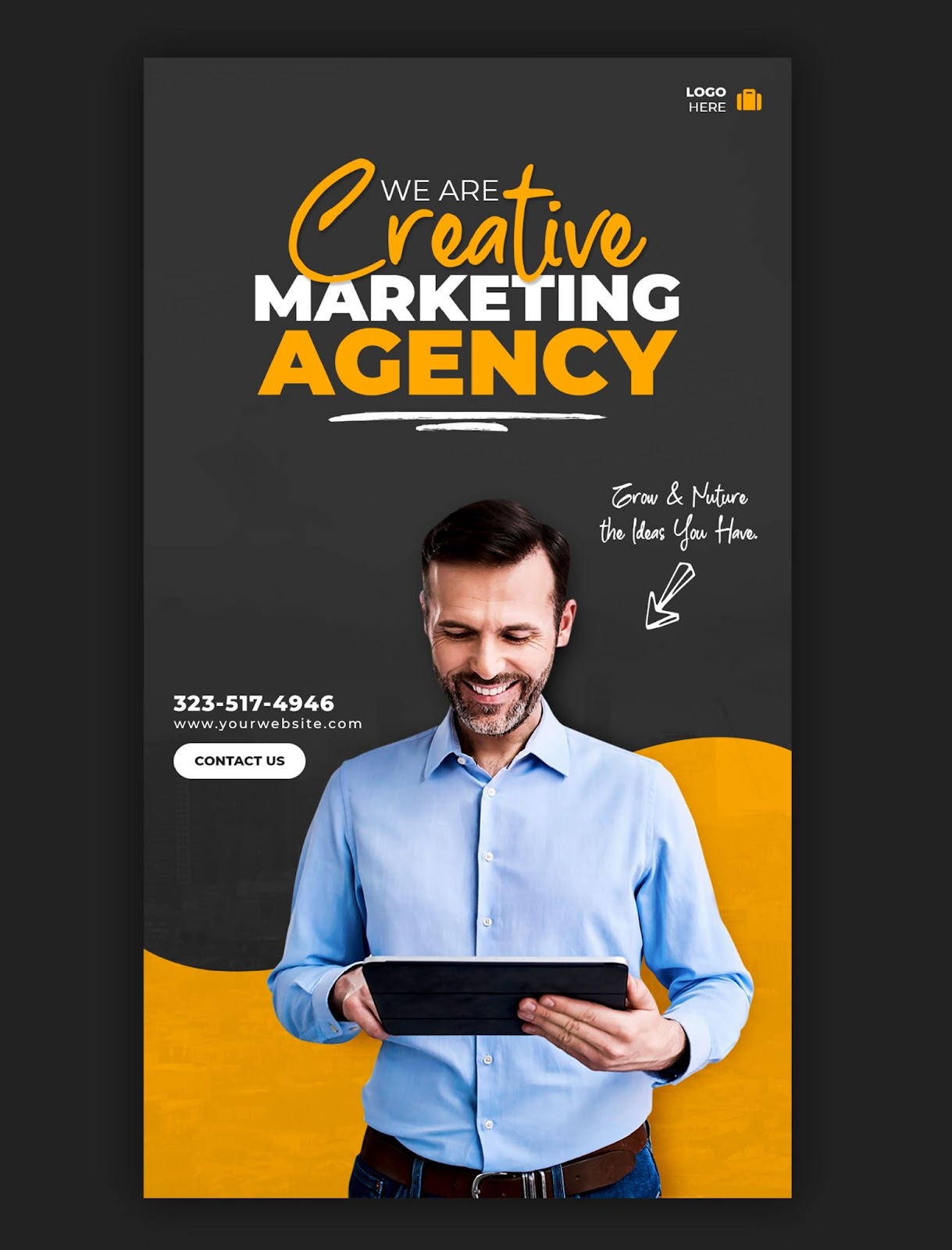
Posters are silent salespeople. They can grab attention, convey information, and spark action in a single glance.
But with so much vying for our visual attention these days, a poorly designed poster can get lost in the noise.
So, how do you create a poster that stops people and delivers your message effectively?
Let's discuss the dos and don'ts of poster design when you work with a poster printing service in Plano to ensure that you craft show-stopping posters that get results.
Grab Attention with a Clear Message and Bold Design
-
Do: Focus on one key message. Your poster should have a singular, clear purpose. Are you promoting an event, announcing a sale, or raising awareness for a cause? Distilling your message into a concise and impactful statement ensures your audience understands what you're all about, even from a distance.
-
Don't: Cram, too much information. Resist the urge to overload your poster with text and imagery. A cluttered design is overwhelming and challenging to read. Focus on the essentials, and let your visuals and concise message do the talking.
-
Do: Leverage the power of visuals. Compelling visuals are what initially draw viewers in. Use high-quality images, bold graphics, and attractive illustrations that resonate with your message and target audience.
-
Don't: Settle for blurry or pixelated visuals. Low-quality images scream unprofessionalism. Invest in good photography or graphic design, or consider using high-resolution stock photos from reputable sources.
Choosing Fonts and Colors Wisely
-
Do: Choose clear, legible fonts. Your audience shouldn't have to squint to decipher your message. Choose fonts that are easily read at a glance, even from a distance. Sans-serif fonts like Helvetica or Arial are generally safe bets.
-
Don't Get fancy with illegible fonts. While you can certainly experiment with different fonts, avoid overly decorative or script-type fonts that are difficult to make out. Remember, clarity is king.
-
Do: Create high contrast with your color scheme. Your chosen colors are crucial in grabbing attention and making your text stand out. Use contrasting colors that complement each other, ensuring your text is easily legible against the background.
-
Don't: Clash with a rainbow of colors. While color can be an influential tool, using too many colors can be distracting and visually overwhelming. Stick to a limited palette of 2-3 colors that work well together.
The Call to Action
-
Do: Include a clear call to action (CTA). What do you want your audience to do after seeing your poster? Your CTA could be anything from visiting a website to attending an event or signing up for a promotion.
-
Don't Leave your audience guessing. A strong CTA removes ambiguity about what you want viewers to do next. Make your CTA prominent and easy to understand, and use action verbs like "Register Now" or "Learn More."
Proofread and Print Professionally
-
Do: Double-check for typos and errors. A typo on your poster can undermine your credibility and professionalism. Proofread meticulously, and have someone else review your design for good measure.
-
Don't: Skimp on printing quality. Investing in professional poster printing in Plano from a reputable service ensures vibrant colors, sharp resolution, and high-quality paper stock. A well-printed poster speaks volumes about your attention to detail and professionalism.
These essential dos and don'ts will help you craft impactful posters that resonate with your audience and achieve your desired results. Well-designed flyers by a flyer printing service in Plano perfectly complement posters for spreading your message. So, unleash your creativity, keep it clear and concise, work with a professional poster printing service in Plano, and watch your posters grab attention and spark action!
Need eye-catching posters? AlphaGraphics West Plano has you covered! We utilize top-notch materials, professional design expertise, and cutting-edge printing tech to bring your ideas to life.