Have you ever been confused by a billboard where one word seems to bleed into the next? Or struggled to “decode” text that was so crowded you needed a magnifying glass to proceed?
While great typography sets the tone for your project, appropriate spacing can make or break a design. Proper type spacing captures audience attention, allowing people to focus on your message instead of concentrating on the mechanics of reading.
Here are three tips for manipulating the metrics for your preferred typeface:
Kerning
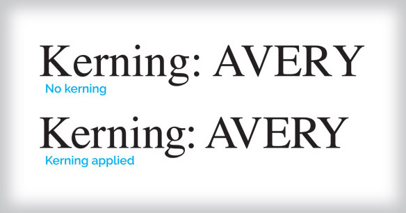
Kerning is the process of adjusting the space between individual letter forms.
Your main goal is a perceived equal distance (or aesthetically pleasing design), and some letters tend to cause problems. For example, diagonal-sided, upper-case letters like A, V, W, and Y (or letters with large crossbars like T and F) can create massive space with upper and lower-case letters near them.

No worries! To tighten the space between individual letters, position the text cursors between two letters (or characters), then hold down option/alt (option/shift on a Mac) while tapping the left or right arrow keys. You may also try choosing “Optical” from the Kerning menu to manipulate characters.
Tracking
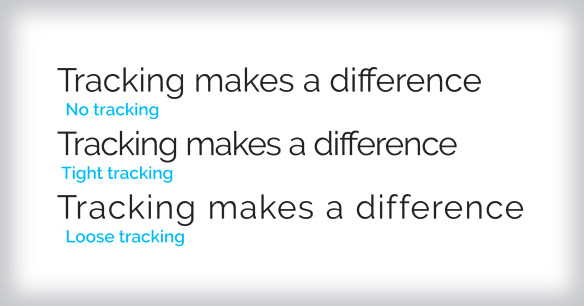
Instead of adjusting the spacing between two characters, tracking uniformly adjusts the horizontal spacing between a range of text, creating a more readable, pleasing texture.

If you want more or less spacing for a word, sentence, or an entire paragraph, highlight that range of text and hold down option/alt (option/shift on a Mac) while tapping the left or right arrow keys to tweak spacing. Instead of adjusting the kerning, this changes the tracking of a whole section of text.
Leading
Leading describes the amount of vertical space between each line of your text.
For content with multiple lines of text, you’ll want to allow appropriate vertical spacing to make your content legible. Wide columns of text make it especially hard for the eye to track from line to line unless you increase the spacing between lines.

To change the leading, highlight the text you want to adjust. Now change the leading to “Auto” or to a numeric value (in points). You can do this in the leading menu of the content panel, the properties panel, the character panel, or in the paragraph or character style options dialog boxes.
Not sure what proportions are best? Adjust leading visually by holding down option/alt (option or option/shift on a Mac) and then tapping the up or down arrow keys until the look is just right!
A Finish That Takes the Cake
Character and line spacing are like frosting – a final touch that makes all the difference. Mastering these fundamental elements creates designs that are well proportioned, readable, and appealing.