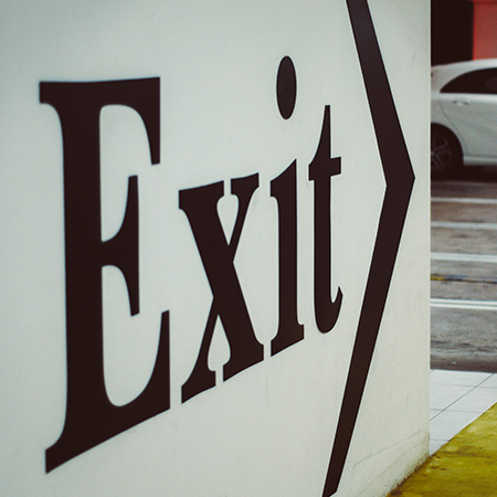
The fonts you choose for your business signs can have a significant impact on how your brand is perceived. The right font can help you stand out in a crowded business district, make your message more readable, and communicate your brand's personality. Knowing which fonts work best for your business sign is an important consideration when designing your signage.
AlphaGraphics Seaport is a custom sign shop that offers a wide variety of sign solutions for your business's needs, including exterior and interior signage, building signage, banners, and more. Here are some best practices for choosing the right fonts for your business signs, and contact us today!

Readability
The most important aspect of font choice in business signage is readability. Ensuring that your message can be easily read and understood will ensure that it doesn't get overlooked. Choosing a font that is legible from a distance is crucial for outdoor signs, while indoor signs require smaller, but equally legible, fonts. Don't get caught up in the beauty of lettering. Let the print marketing experts at AlphaGraphics Seaport help you with your business signs today.

Brand Identity
Fonts play an important role in communicating brand identity. Your font choice should align with your brand's personality and message. A bold, modern font may work well for a cutting-edge tech company, but may not make sense for a more traditional business. It's important that the font you choose is consistent with the broader identity of your brand. Get advice from our custom sign shop today!

Simplicity
In business signage, including large format signs and channel letter signs, simplicity is key. A font that is too complicated, cursive, or ornate can be difficult to read and may not translate well to large signage. Choosing a simple sans-serif font that is clean and easy to read will help ensure that your message is communicated effectively. With years of experience, our sign shop understands the best types of font to use and can match them to your branding. Call AlphaGraphics Seaport today!

Contrast
The contrast between your font and background is critical to readability. A font that blends in too much with its background can make your message difficult to read. Choosing a font with enough contrast against the background of your sign, whether it's a wall mural or window graphic, will create legibility and make your message pop. color can play a big role here, too, when thinking about contrasts in your business signage. Ask us today!

Kerning and Tracking
Kerning refers to the spacing between individual letters on your business's sign, while tracking refers to the spacing between groups of letters. Proper kerning and tracking can improve legibility dramatically and make your message more effective. Poor kerning can lead to misinterpretation or confusion, so make sure that your font's spacing is consistent. Get expert advice today!

Consistency
Consistency in font choice for your banners, posters, or other interior and exterior business signs is crucial to creating brand recognition. Using different fonts for different pieces of business signage may be confusing or inhibit recognition. Make sure that your font is consistent across different signage assets, products, and marketing materials, so your voice is heard loud and clear. Get started today!
PARTNER WITH OUR CUSTOM SIGN SHOP TODAY!
Choosing the right font for your business sign is essential to create effective signage. AlphaGraphics Seaport offers a wonderful variety of business signs, including monument signs, directional signage, and logo signs, to meet your needs. When you partner with our custom sign shop, you can expect the best business signage to stand out from a crowd. Call today!
Contact Us Today