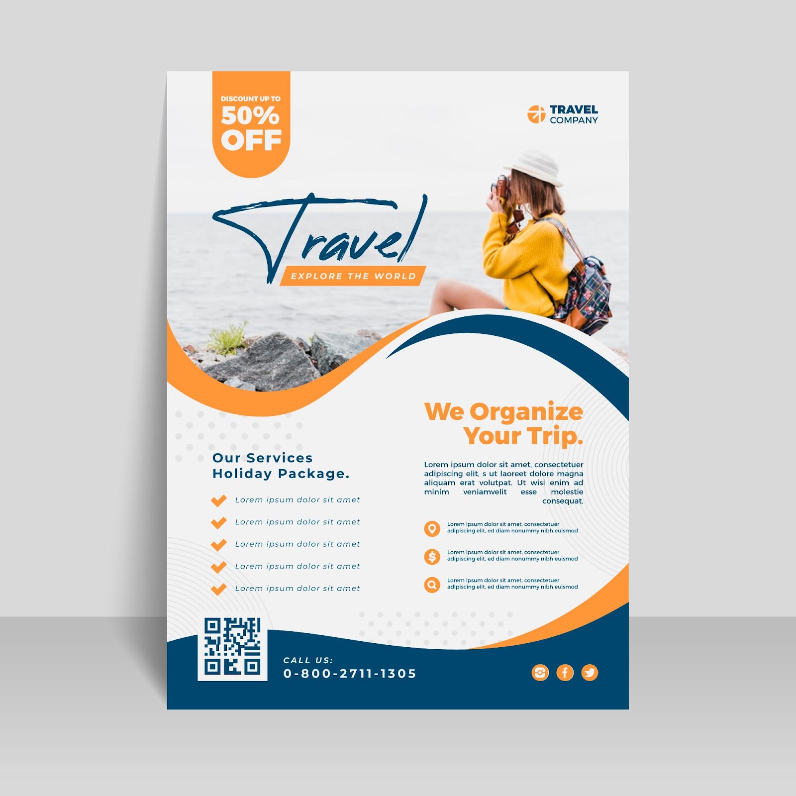
Flyers are an effective marketing tool for businesses. They are affordable, versatile, and can quickly reach a large audience. However, simply printing out a generic flyer isn't enough to make an impact. One of the critical elements of flyer printing in Olathe is typography, or the design and use of fonts.
Typography is crucial in flyer printing, as it can significantly affect how your target audience receives your message. Imagine receiving a flyer that is difficult to read because of poor font choices or overcrowding of text. Chances are, you would quickly discard it and move on to the next one.
On the other hand, a well-designed flyer with appropriate typography can catch the attention of potential customers and entice them to take action. Here are some key points to keep in mind when considering typography for flyer printing in Olathe:
-
Font Choice Matters
The selection of fonts is crucial in flyer design. Different fonts can convey different moods, tones, and levels of professionalism. Serif fonts, for example, offer a traditional and trustworthy feeling, making them suitable for formal occasions or services. On the other hand, sans-serif fonts provide a modern and approachable look, which can be perfect for tech startups or casual events. Ensuring your font matches the message and tone of your content is critical to making your flyers resonate with your intended audience.
-
Readability Is Key
Beyond aesthetics, readability is paramount in flyer design. This includes considering font size, color contrast, and spacing. Your flyer's message will be lost if your audience struggles to read the information because the text is too small or the color contrast is low. Keeping text legible and well-organized helps convey your message effectively and enhances the flyer's overall appeal.
-
Hierarchy and Layout
Creating a visual hierarchy within your text can guide the readers to the most critical information first. Using different font sizes, weights, and colors, you can emphasize key points, such as the event date or a special offer, ensuring they stand out at a glance. A well-planned layout helps structure the information coherently, facilitating a better understanding of the content presented.
-
Consistency in Branding
The typography on your flyer should align with your brand's overall identity. Consistency in font choices across all marketing materials solidifies brand recognition and builds trust with your audience. When your flyers reflect the same visual elements as your website, business cards, and other promotional materials, they create a cohesive brand experience for your customers.
Work with a Professional Flyer Printing Service in Olathe
At AlphaGraphics SKC , we understand the significance of flyers in effectively promoting your business, product, or event. We use the latest design software and techniques to create eye-catching flyers that convey your message clearly and concisely. Our experts can help you with every step of the process, from conceptualization to printing, ensuring that your flyers make a lasting impact on your target audience.
In addition to our flyer printing service, we offer a brochure printing service in Olathe to complement your marketing efforts. Each brochure is custom-designed to represent your brand and deliver your message effectively. Contact us today.