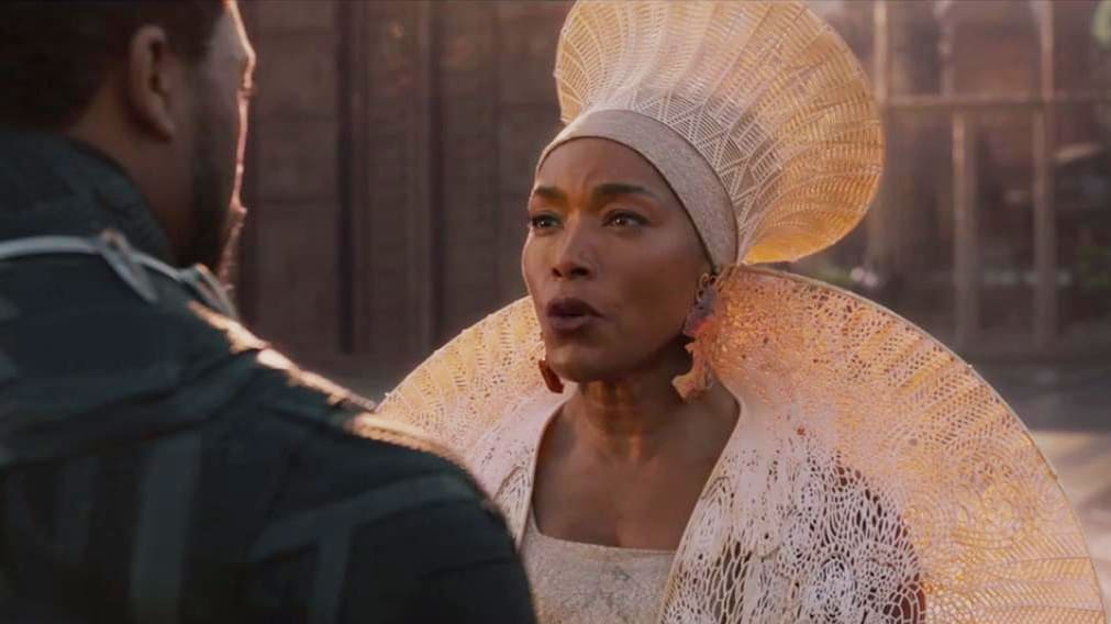
I am so behind on all the things I would normally be gushing about by now - I barely watched any of the Super Bowl ads and I completely forgot to record the Olympic Opening Ceremony. I don't even know who is competing for USA in the figure skating events and that's just a travesty. The only entertainment coverage I have been following has been the various Black Panther premieres, because I am so excited to see it and every outfit - costumes and red carpet looks - have been amazing.

What I love about what the designers and cast of Black Panther are bringing to the table is how they are celebrating African culture in everything they show and wear. It's a culture that we in the West don't normally see given much reverence, and it is so refreshing. If you're interested,
read the interviews with costume designer Ruth Carter on how she brought the world of Wakanda to such vibrant life (They 3D printed Angela Basset's hat! How cool is that?)
Part of the downside of learning design in the early days of the computer era meant an over-use of what I would deem "ethnic" inspired fonts & imagery. There is a reason why Papyrus is a standard font across all computer systems - if you needed a vaguely Mediterranean/Eastern/Asian font without using an overly stereotypical calligraphy font, it was a "safe" alternative.
In past years, I have tried to steer away from this generic line of thinking, as we work with international clients all the time. Adding a cultural feel or inspiration to a design can be done with color and imagery as well as text, and all three can be done in ways that are respectful. Offensive design is lazy - we need to grow beyond cliche fonts and vaguely ethnic clipart.