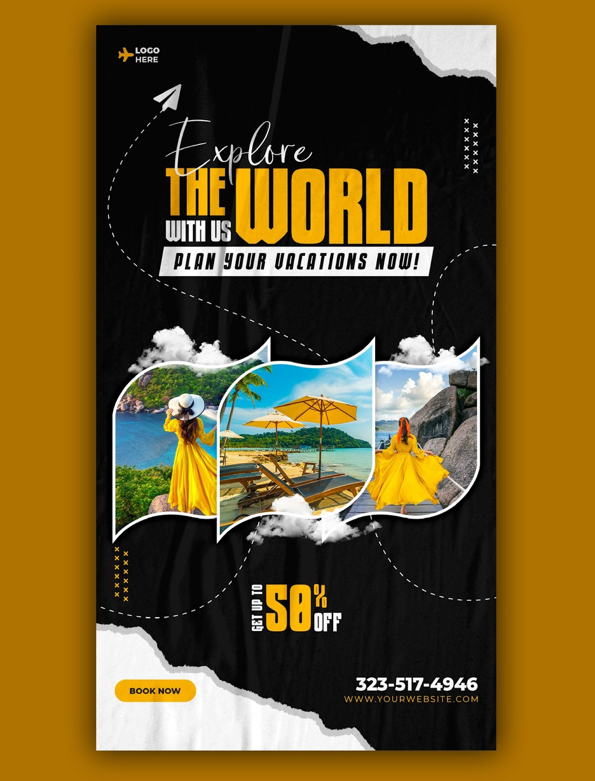
Posters are a fantastic way to grab attention, spread information, and leave a lasting impression.
But a powerful image alone isn't enough. To truly make your posters shine, you need to harness the power of effective text.
Let's discuss how a poster printing service in San Francisco can transform your posters from good to great with the strategic use of words.
Crafting a Captivating Headline
First impressions matter; your headline is the first thing viewers will encounter. Here's where you need to hook them in.
-
Keep it short and sweet. Aim for 6-8 clear, concise, and impactful words.
-
Use strong verbs and an active voice. Instead of "Join the Movement," try "Empower Change Now!"
-
Benefit over features. Don't just tell them what it is; tell them what it does for them.
-
Consider a question to spark curiosity. "Ready to Level Up Your Skills?" is more engaging than just listing a course name.
Remember, your headline is like a movie trailer. It should pique interest and leave viewers wanting more.
Hierarchy is Your Friend
Just like a well-organized room, your poster needs a clear information hierarchy. This helps viewers understand what's most important at a glance.
-
Headline: The most significant and boldest text, grabbing immediate attention.
-
Subheading: Provides context or additional details about the headline using a slightly smaller font size.
-
Body Text: This section contains key information like dates, times, locations, or website addresses. Use a readable font size and keep it concise.
Using different font sizes and weights, you create a visual hierarchy that guides the viewer's eye and ensures they don't miss the crucial details.
Speak Their Language
Imagine a conversation with your target audience. What words would resonate with them?
-
Use clear and concise language. Avoid jargon or overly complex terms.
-
Tailor your tone to your audience. Playful and informal for a music event, professional and informative for a business conference.
-
Benefit-driven language. Highlight how your message improves their lives or solves a problem.
Think of your poster as a direct message to your audience. Use language that feels genuine and connects with them on a personal level.
The Power of White Space
White space isn't wasted space; it's essential for creating a visually balanced and impactful design. When your poster is crammed with text, it becomes overwhelming and hard to read.
-
Leave generous amounts of white space around text elements. This allows them to breathe and makes them stand out.
-
Don't be afraid of large blank areas. This can draw attention to critical elements and create a sense of focus.
-
Consider a minimalist approach. Sometimes, a single powerful statement can be more impactful than a wall of text.
Call to Action
Your poster shouldn't just inform; it should inspire action. Tell viewers exactly what you want them to do next.
-
Use clear and actionable verbs. "Register Now," "Visit Our Website," or "Join the Discussion."
-
Make it easy to follow through. Include website addresses, social media handles, or QR codes.
-
Consider urgency. "Limited Spots Available!" or "Offer Ends Soon!" can encourage immediate action.
A solid call to action transforms your poster from a passive display into an active communication tool.
Ready to Create Powerful Posters in San Francisco?
These tips can elevate your posters from good to great. Remember, impactful visuals combined with well-crafted text create a winning combination.
Whether promoting an event, showcasing your brand, or spreading a message, using a poster printing service in San Francisco can help you create professional-quality posters that get noticed.
Sign shops often offer poster printing in San Francisco alongside signage solutions. Explore your options and find a printing partner who understands your needs and can bring your vision to life.
AlphaGraphics Downtown San Francisco offers high-quality poster printing services with various paper stocks and vibrant colors to make your message stand out. From design consultations to final printing, we ensure your posters look polished and leave a lasting impression.